Tuesday, 6 May 2008

REFERENCES

copyright.com. [n.d] copy right business laws. [Internet]. Available from:http://www.copyright.com/[accessed February 2008]

Mintel oxygen. [2007] Menswear issues. [Internet]. Available from:http://academic.mintel.com/sinatra/oxygen [accessed January 2008]

More T Vicar. [2003] Men's tees. [Internet]. Available from:http://www.moretvicar.com/index.php[accessed February 2008]

Pin up Toons. [2008] Gallery. [Internet]. Available form:
http://www.pinuptoons.com/Main-Page/Main.htm [accessed March 2008]

Poloshirts.co.uk. [2008].Home.[Internet]. Available from:
http://www.polo-shirts.co.uk/ [accessed January 2008]

The pin up files. [2008] Art galleries. [Internet]. Available from:
http://www.thepinupfiles.com/index.html [accessed February 2008]

The U.K copyright services. [2008] copyright infringements. [Internet]. Available from:
http://www.copyrightservice.co.uk/ [accessed February 2008]

Thursday, 1 May 2008

HOW TO USE THE BLOG

HOW TO USE THE BLOGO
In the far right of the page thers is a ARCHIVE menu.Click on JANUARY and go to the bottom of the page and work your way up.To start a new month click on the next month on the ARCHIVE menu.
(REMEBER TO WORK YOUR WAY UP THE PAGE INSTEAD OF DOWN THE PAGE)
Posted by tom partridge

MINI-EVALUATION

Looking back over the blog really shows the general progression of my work from square one. It shows the development and progression of my work throughout the project. I am really pleased hoe the look of the brand has come together and introducing this taboo lifestyle. I really do not regret making the derision of changing the logo to a topless one because it completes the taboo nature of the brand. The brand actually has potential to be launched as a brand because of the research into the market, the brands look and most importantly the t-shirt designs.
If I could change something about the brand I would change the logo, which contradicts myself but i feel that even tho the design process took longer than I thought I could even spend longer on it months more. But due to my time restrictions I had to make the decisions quickly.
I have thoroughly enjoyed this project, and t-shirt design has become a huge interest of mine since doing the breast cancer project.

Friday, 18 April 2008

SUBMITTING MY WORK

I have been thinking about how to submit my work and I have come up with submitting it inside a hat box? By spraying it red and filling it with:

  • A5 Promotional Booklet


  • Business Cards


  • Interactive PDF (in a CD case)


  • A5 Press Release


  • promotional material e.g. condoms?
I decided on the idea of using condoms as promotional material for the brand was a genius idea because it promotes safe sex and sex in general is a little bit 'taboo'.
I decided to make a cover and spray the CD case for the interactive pdf because it looks part of the brand.
Filling the box with red tissue paper filled out the box and made it more presentable.

INTERACTIVE PDF

I have found a way of displaying how the web site would work and look without actually putting it on the web ! by creating a interactive PDF which can be sent via email or burned on to CD. It opens up in Acrobat and is viewed like a normal PDF except you can click on certain areas of the image and it will navigate you around the site! genius!

Wednesday, 16 April 2008

WEB SITE LAYOUT


WEB SITE PAGES

I have designed the brand website, but unfortunatley it is beyond my knowledge of how to physically put one on the web. So the design will have to do!

MAIN PAGE

PRESS RELEASE

PRESS RELEASE CONT...


TARGET AUDIENCE


RANGE


RANGE CONT...


RANGE CONT...


RANGE CONT...


RANGE CONT...


RANGE CONT...


RANGE CONT...


CONTACT


BUSINESS CARD


FRONT


BACK


Thursday, 10 April 2008

HOLD UP!

You can enlarge the photos but be warned they are big!

BOOKLET...


BOOKLET...


BOOKLET...


BOOKLET...


BOOKLET


IM BACK!

For the past month I have been working hard on creating a promotional for my t-shirt brand. Me being me I'm too much of a perfectionist and I wanted it to be perfect and represent the brand and I think I have done just that!
I have uploaded the booklet to show you what it looks like, unfortunately you can not enlarge them because the file sizes are too big but IL give you a run down:
The style of the booklet is very 1950's diner menu!
  • Manifesto (a bit about who I'm aiming at)
  • Menu (in the style of a food menu giving a description of the contents of the booklet)
  • Please Wait (iv done this page because it tells you a small bit about the brand e.g. ethical trading standards)
  • Taboo title range( in the style of a 1950's boxing poster, I wanted to create a variety of visual images in the booklet so it doesn't look monotone and dull to look at but also keep in the era of the brands look)
  • Taboo range (offering what you get on both sides of the t-shirt)
  • Taboo range close up ( some of the graphics didn't do its justice being small, so I decided to create a page which showed it bigger)
  • Taboo range
  • Taboo range close up
  • Please Wait
  • Headless range title (I wanted this in the style of a 1950's horror movie poster)
  • Headless range (similar layout as the Taboo range but with all the horror trimmings)
  • Headless range close up
  • Headless range
  • Headless range close up
  • Please Wait
  • Sweetest range title (I wanted this to represent my best efforts so I decided to do it in the style of a golden theater ticket)
  • Sweetest range ( similar layout as the others but golden)
  • Sweetest range close up
  • Sweetest range
  • Sweetest range close up
  • Coming soon ( I wanted to show that the brand has potential to break out from just t-shirts and become a whole fashion brand...eventually)
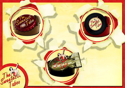
  • Belts (While I was designing my logo I came up with the style of a vinyl record, bottle cap and bomb style background for the logo...but they were never practical as a logo but as a belt buckle they look sweet)
  • See you soon

Monday, 24 March 2008

SWEETEST RANGE LOGO


I have changed this too because it is more cheekier!
and I have changed the angle of her arm a tiny bit too!

HOLD THE PRESS

OK after some heavy consideration and allot of opinions, advice and general feedback I have decided to change the logo a tiny bit!!!!!!!!! nothing too big but something that has been bugging me for a while because of the controversialness of the logo so I have decided to make her slightly topless OMG I hear you say but i think this represents the brand more and the Taboo factor goes up 10x to draw people to the brand!

Friday, 14 March 2008

PROMOTIONAL BOOKLET

To create this promotional booklet I need to make sure:

  • It keeps in continuity with the style of the brand
  • It creative for people interact more with the booklet
  • It represents the t-shirts to their full extent
  • It clearly shows the three brand ranges
  • It is portable and easy to store

Creating a promotional booklet was originally going to be a creative pop up book but realistically looking at examples this would not be practical for a promotional booklet because it has to mainly be about the product itself.