Friday, 18 April 2008

SUBMITTING MY WORK

I have been thinking about how to submit my work and I have come up with submitting it inside a hat box? By spraying it red and filling it with:

  • A5 Promotional Booklet


  • Business Cards


  • Interactive PDF (in a CD case)


  • A5 Press Release


  • promotional material e.g. condoms?
I decided on the idea of using condoms as promotional material for the brand was a genius idea because it promotes safe sex and sex in general is a little bit 'taboo'.
I decided to make a cover and spray the CD case for the interactive pdf because it looks part of the brand.
Filling the box with red tissue paper filled out the box and made it more presentable.

INTERACTIVE PDF

I have found a way of displaying how the web site would work and look without actually putting it on the web ! by creating a interactive PDF which can be sent via email or burned on to CD. It opens up in Acrobat and is viewed like a normal PDF except you can click on certain areas of the image and it will navigate you around the site! genius!

Wednesday, 16 April 2008

WEB SITE LAYOUT


WEB SITE PAGES

I have designed the brand website, but unfortunatley it is beyond my knowledge of how to physically put one on the web. So the design will have to do!

MAIN PAGE

PRESS RELEASE

PRESS RELEASE CONT...


TARGET AUDIENCE


RANGE


RANGE CONT...


RANGE CONT...


RANGE CONT...


RANGE CONT...


RANGE CONT...


RANGE CONT...


CONTACT


BUSINESS CARD


FRONT


BACK


Thursday, 10 April 2008

HOLD UP!

You can enlarge the photos but be warned they are big!

BOOKLET...


BOOKLET...


BOOKLET...


BOOKLET...


BOOKLET


IM BACK!

For the past month I have been working hard on creating a promotional for my t-shirt brand. Me being me I'm too much of a perfectionist and I wanted it to be perfect and represent the brand and I think I have done just that!
I have uploaded the booklet to show you what it looks like, unfortunately you can not enlarge them because the file sizes are too big but IL give you a run down:
The style of the booklet is very 1950's diner menu!
  • Manifesto (a bit about who I'm aiming at)
  • Menu (in the style of a food menu giving a description of the contents of the booklet)
  • Please Wait (iv done this page because it tells you a small bit about the brand e.g. ethical trading standards)
  • Taboo title range( in the style of a 1950's boxing poster, I wanted to create a variety of visual images in the booklet so it doesn't look monotone and dull to look at but also keep in the era of the brands look)
  • Taboo range (offering what you get on both sides of the t-shirt)
  • Taboo range close up ( some of the graphics didn't do its justice being small, so I decided to create a page which showed it bigger)
  • Taboo range
  • Taboo range close up
  • Please Wait
  • Headless range title (I wanted this in the style of a 1950's horror movie poster)
  • Headless range (similar layout as the Taboo range but with all the horror trimmings)
  • Headless range close up
  • Headless range
  • Headless range close up
  • Please Wait
  • Sweetest range title (I wanted this to represent my best efforts so I decided to do it in the style of a golden theater ticket)
  • Sweetest range ( similar layout as the others but golden)
  • Sweetest range close up
  • Sweetest range
  • Sweetest range close up
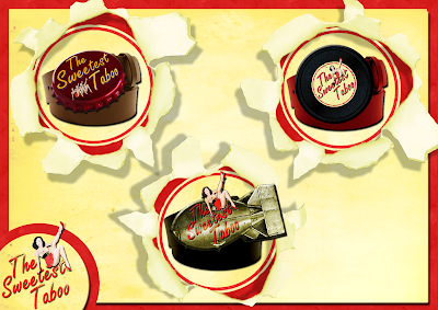
  • Coming soon ( I wanted to show that the brand has potential to break out from just t-shirts and become a whole fashion brand...eventually)
  • Belts (While I was designing my logo I came up with the style of a vinyl record, bottle cap and bomb style background for the logo...but they were never practical as a logo but as a belt buckle they look sweet)
  • See you soon